When decorating your home, there are many interior design style tips and tricks you can use to make a statement. Of course the number one thing you should use is how it makes YOU feel and what YOU like. After all, it’s YOUR home!
In this blog post, I’m going to give you three options to add some interest and style to your home and how to use them effectively. Layering, using focal points, and vignettes are interior design style elements that can be easily used and are cost effective because you can use items you already have. Or you can purchase a few new pieces to add in as well.
Layering
You more than likely use layering in your home already. Layering is using different elements in a space to add visual interest and appeal. It adds depth and interest to a space. Layering works best if it seems effortless but also well put together. Each element used in your decor can be a layer. Starting with the paint or wallpaper to the flooring and rugs. Furniture, wall art, and accessories also add layers.
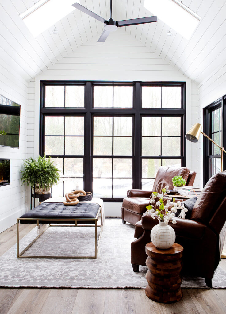
The best place to start is from the ground up. Think about how you want to build the space. Visualize and make a plan for the space. If you want to add paint to the walls or ceiling, put up wallpaper or change the flooring, those projects will need to be completed first. Start with a color palette in mind to build from. Then the fun additions can begin.
Starting with the rug, determine if it will be the focal point (see below) or simply an added texture to the room. The lighting is also a layer. Adding lamps to the current lighting can give a space more interest. The furniture pieces are a heavier layer that can have throws and pillows placed on them to give a softer additional layer. Lastly would be the accessories on the tables, plants, and window coverings, if wanted.
Focal Points
When choosing a focal point, it should be something you love, the biggest item , or what you want noticed first. It is where the eyes are drawn to when entering the room. The statement piece that you want everyone talking about. It could be any part of your decor, a rug, artwork, or an accessory. It is important because it is the first place that the eye lands so it makes a statement about the feel of the room and what your style is. In the end, it’s your home so it should be what makes you feel something.
The focal point could be something that is fixed in the room, such as the lighting, an accent wall, or decorative flooring. It could also be something that can easily be changed as your style changes. There could also be more than one focal point in a room as long as they are in different areas. Too many in the same area compete with each other and your eyes don’t know where to go first.
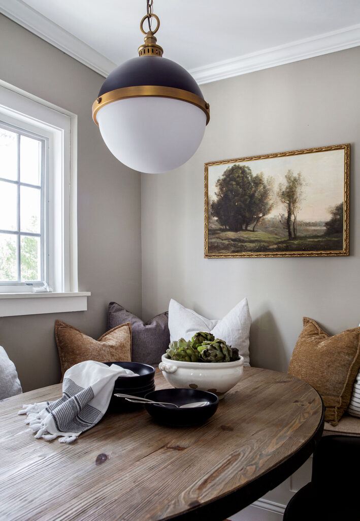
Ways to emphasize or enhance the focal point could be to choose an item that stands out because of its color, design, or pattern. If your room is mostly neutral in color, the focal point could be a colorful rug or chair. Something that says “look at me first!” is what you should think of when choosing that perfect statement piece.
Vignettes
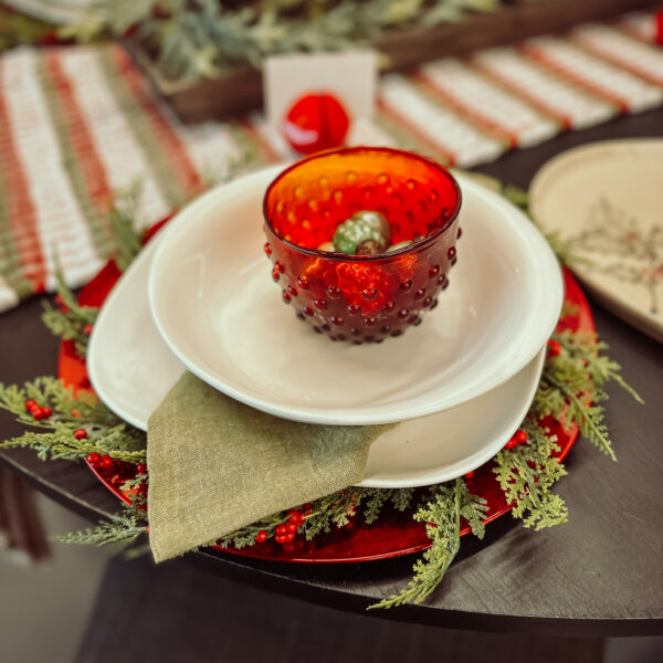
A vignette is a fancy word for a small grouping. It’s used when decorating to display objects together on a table, tray, or shelf. A vignette is different from a focal point in that it doesn’t necessarily have to make a statement. Instead it’s a way to display some of your most treasured items, add color or different textures to a room, or support the theme or style of your space.
Some tips to remember are to group items in odd numbers and use varying heights and depths. Groups of three or five create more visual interest than groups of two or four. The odd numbers allow you to place items offset from each other and force your eye to move around the arrangement. Using varying heights will accomplish much of the same as using odd numbers. If the items are similar in height, they will compete with each other and won’t be as appealing to the eye. Add books or a riser to give more height to one item or find a taller item altogether. Add depth to the vignette by placing one item towards the front of the table or shelf.
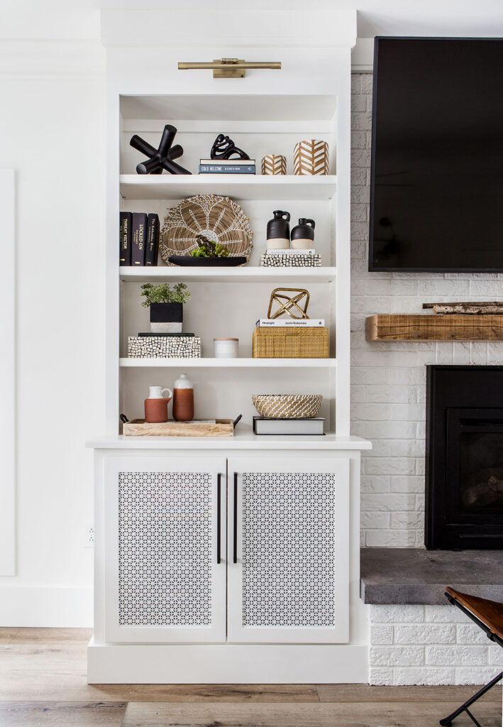
Using different textures, colors, and styles of items are another way to give the vignette more interest. Matching a ceramic vase with a potted plant and a wood bowl brings in more texture and natural elements. Using pieces that complement each other with the same color palette but different heights and shapes is a great place to begin.
Using Layering, Focal Points, and Vignettes Together
All three of these interior design options can be used seamlessly together. A room could have a statement lighting fixture, rug with furniture, and a vignette on a table as shown here.
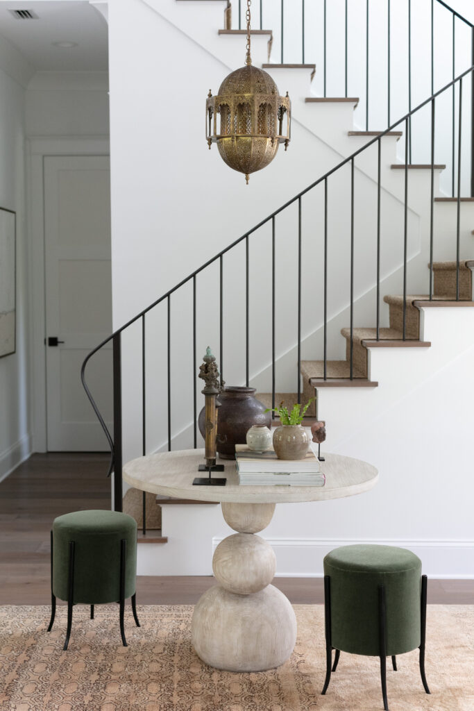
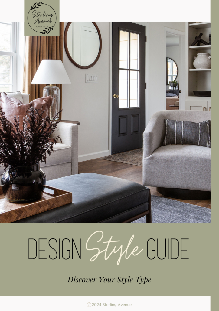
When combining all three together, it gives the space a more cohesive look and ensures harmony and balance. Begin by looking at your space and identifying all the ways you already use these three options. You may be surprised! Then use these tips to make updates using what you already have. Sometimes it also helps to know your preferred design style. If you’re not sure, I have a Design Style Guide I created to help.
