In a recent weekly newsletter to my customers, I asked if anyone would be interested in seeing some before and after results of some of our design and remodeling projects. The response was an overwhelming YES! So, while I’m still trying to talk my husband, Paul, into starting some projects in our own home, I thought I’d start a little series of our past flips and remodeling jobs we have completed. I’m going to start with my favorite; a 1875 home that we flipped back in 2020.
The over 145 year old home had already had a few updates when we bought it. The main suite had been added on, new siding and windows installed, the back porch had been enclosed for a laundry room, and one other bathroom added. But other than that, the rest was pretty original to the home. I loved it immediately! I could see what the house could be. It had two sets of beautiful French doors, a gorgeous staircase, huge living room, office, original trim, a small kitchen, and a total of five bedrooms and three and a half baths. However, Paul saw all the work. It was a 2,500 square foot two-story house with a basement. It was double the size of any house he’d ever flipped. He knew it would take longer than he wanted, but the price was right and I couldn’t wait to get started!
The House
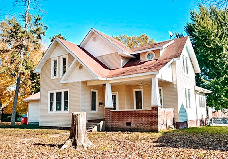
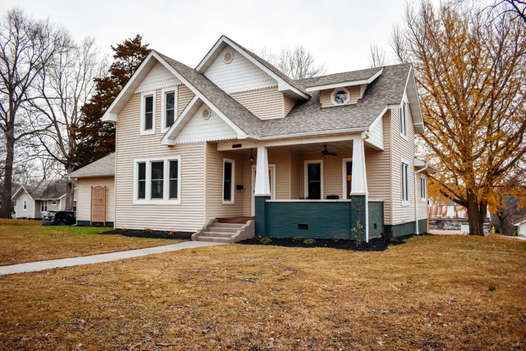
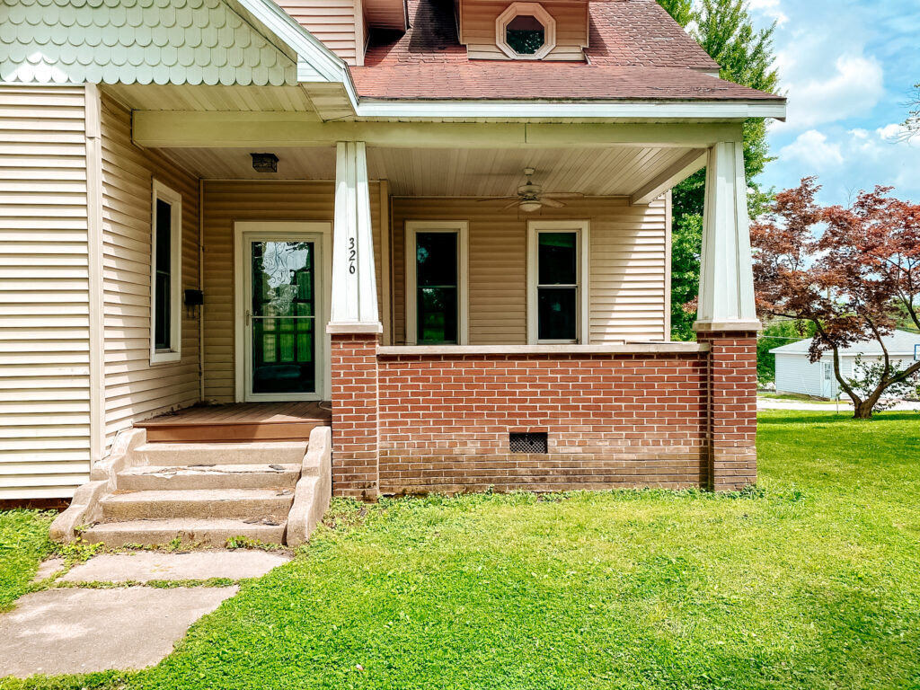
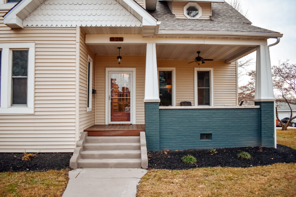
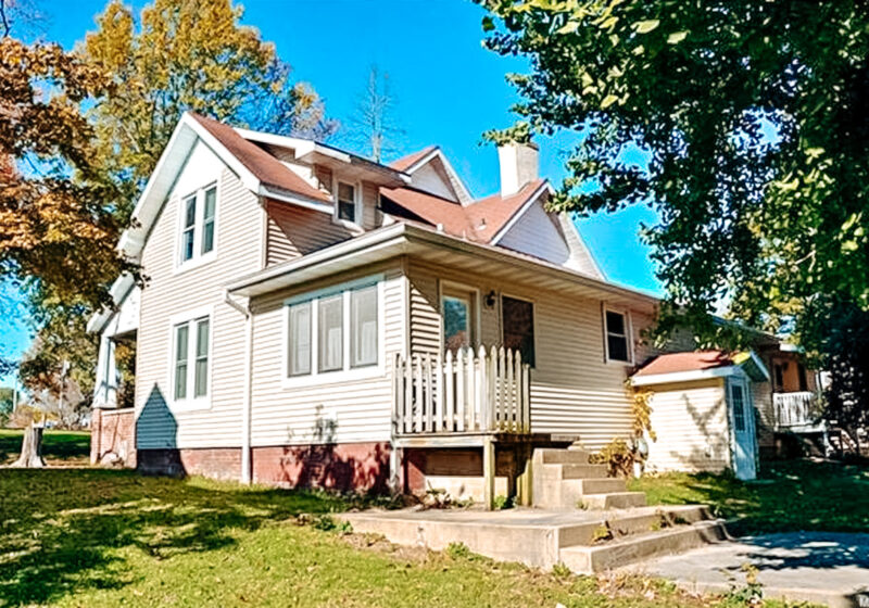
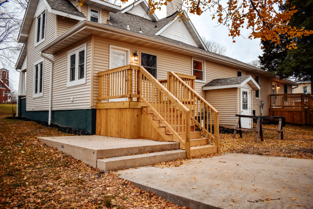
The outside was probably the easiest to complete, since the previous owners had replaced the siding and the windows. There were a few small repairs needed to the exterior and the roof was in really bad shape. Luckily there wasn’t any structural damage but the shingles were practically sliding off the roof. That job was one of only three items that we didn’t complete ourselves. The other outside projects were painting the foundation, replacing two decks on the back, and refreshing the front porch and sidewalk. We also did a little landscaping around the house.
The Dining Room
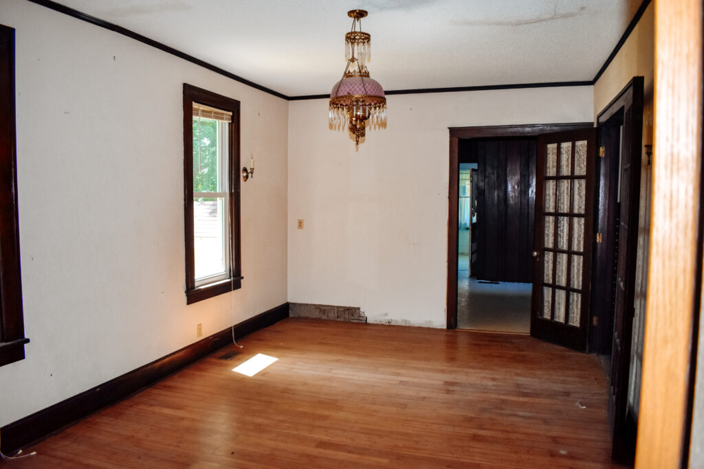
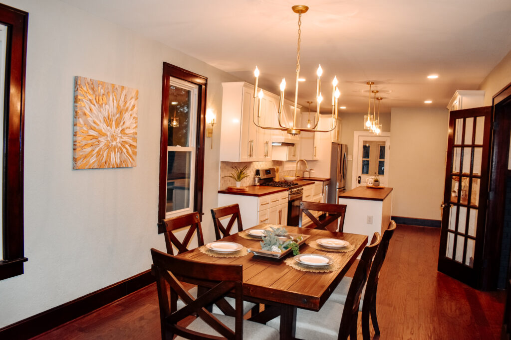
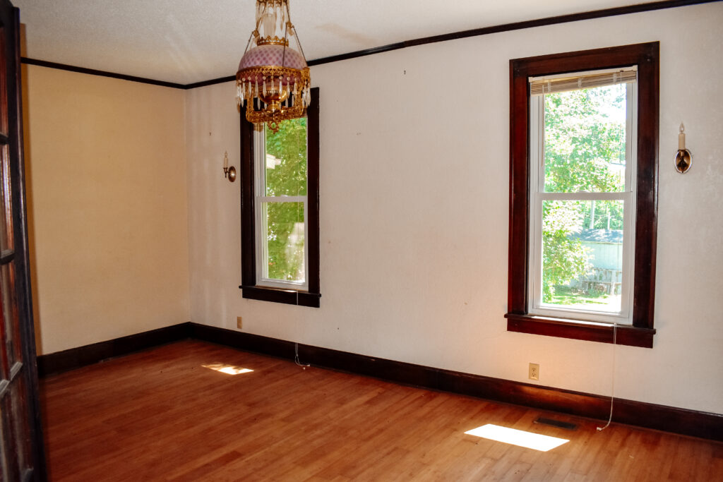
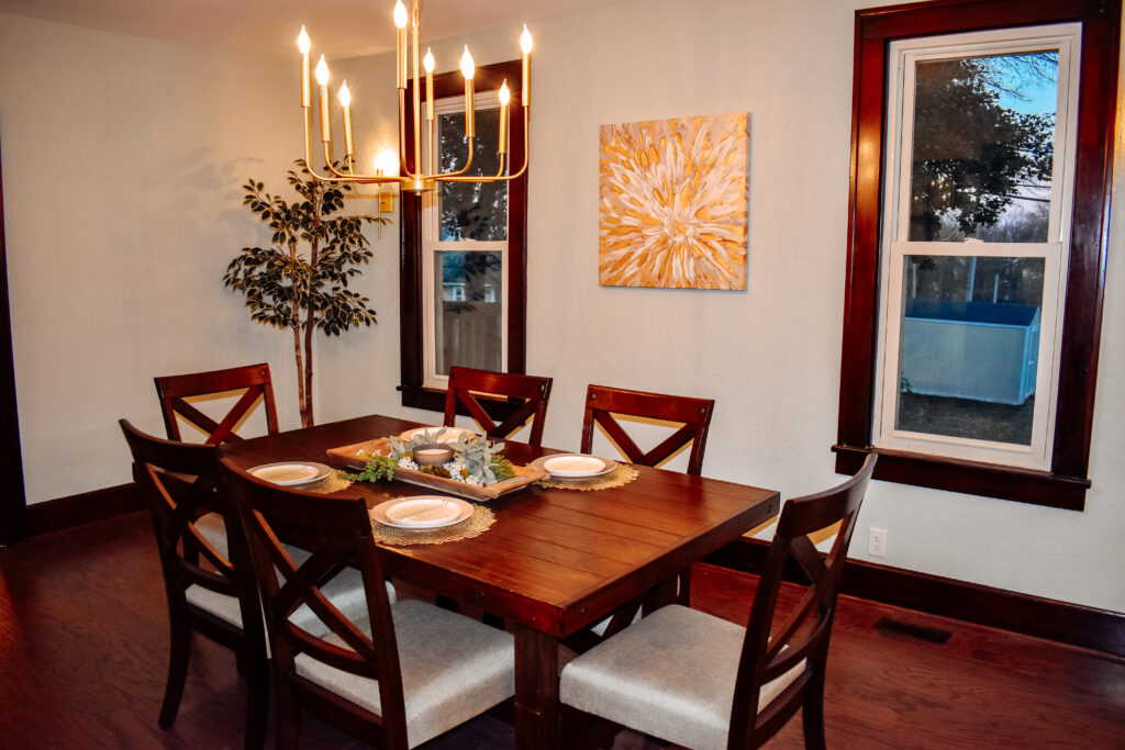
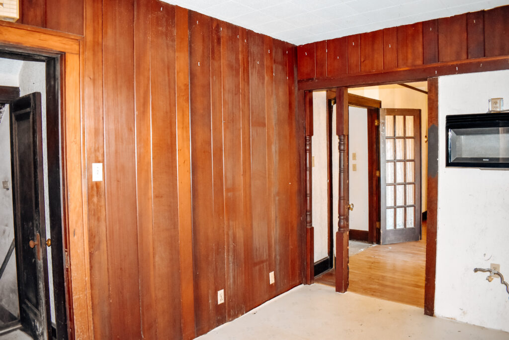
I had so many favorite spaces in this home that I’m having a hard time deciding where to start! But I think it would have to be the transformation of the kitchen and dining room area. There was a wall between the two rooms which really made the kitchen small and dark. That wall was really the only true demo that we had to do and the kids absolutely loved it! Using a sledge hammer was the highlight of their summer.
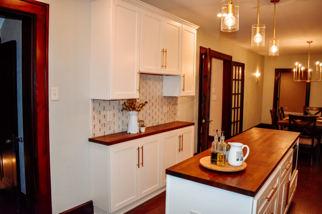
Removing the wall gave us room to extend the kitchen and join the two rooms together. The dining room only needed paint, new lighting, and flooring, which we added the same flooring throughout the whole house. There was also an original set of French doors leading from the dining room into the living room. All of the doors and trim work were cleaned and re-stained to the original mahogany color.
The Kitchen
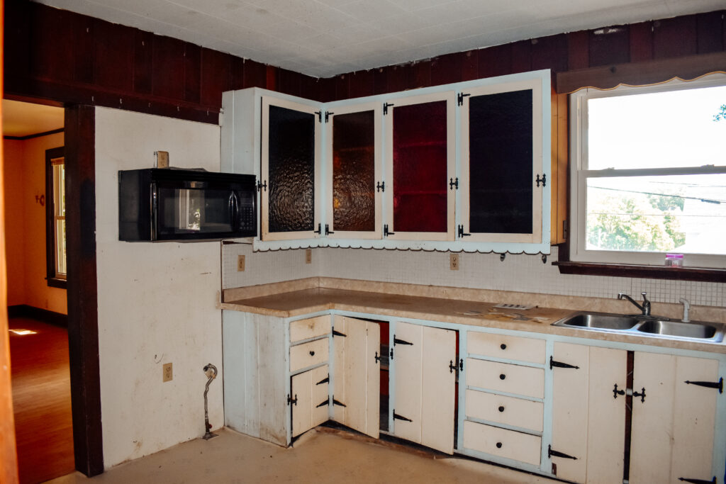
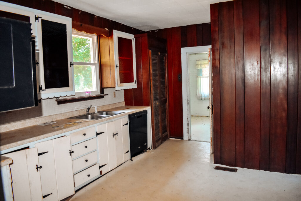
The kitchen was another story. It probably took the longest to prep and complete. It was the worst room in terms of being outdated and the amount of work needed. Just look at the before pictures… yuck! We had to completely gut it. The walls throughout the house were also plaster which had to be repaired in spots as well.
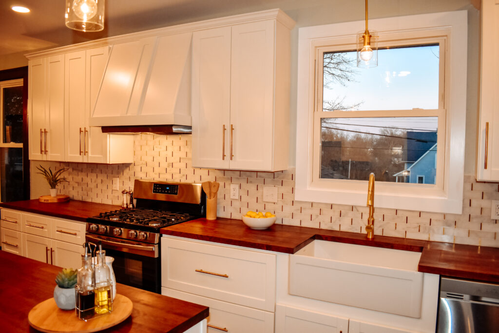
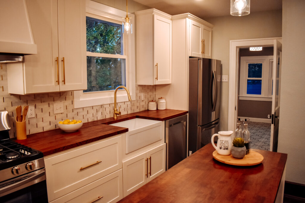
With the wall gone and all the cabinets out, it made it easier to picture what we could do with the layout. It was still a small space and I wanted to add as much storage to the kitchen as possible. We decided on white cabinets, butcher block countertops, gold hardware and lighting, and a farmhouse sink. One wall had shallow upper and lower cabinets for a coffee bar/pantry area. The other wall held all the appliances with a custom range hood built by Paul. We also added an island in the middle for more storage with pendant lights above. The backsplash was white marble with gold accents. It was absolutely beautiful when we were finished. I just LOVED that kitchen!
The Laundry Room
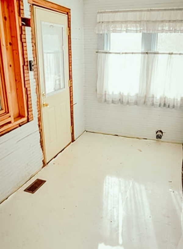
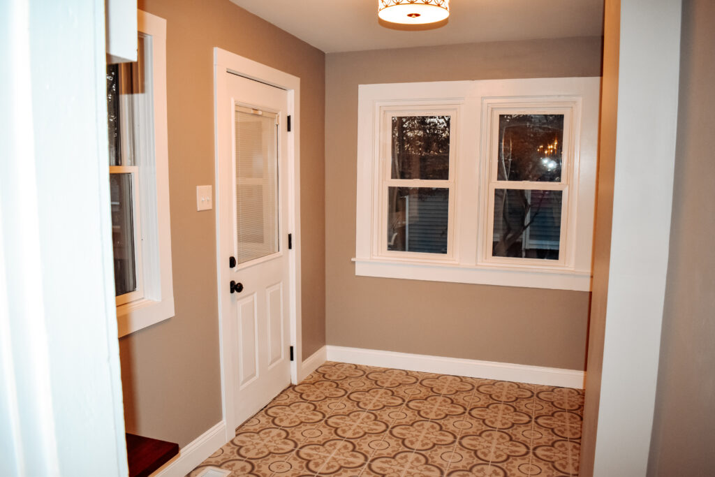
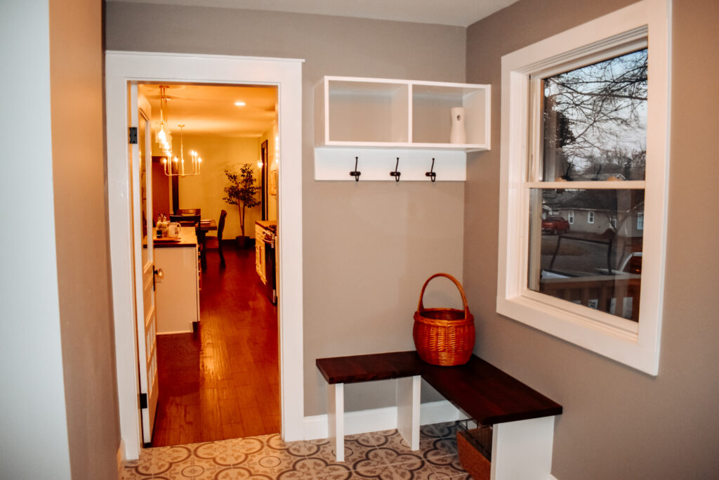
Just off the kitchen was the old porch that the previous owners had enclosed and turned into the laundry room. It was extremely small. On the other side of the wall was a bathroom that had a little bit of a weird layout. I redesigned its layout so we were able to take some space from it to add to the laundry room. Paul had to take out a window to make it work but it was worth it. The washer and dryer were able to be inset more into the wall to add space to the room. Cabinets were added above them for storage. I also designed a little mud room space and added a fun decorative tile to the floor.
The Main Suite
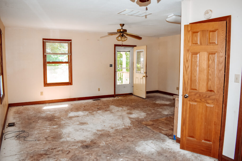
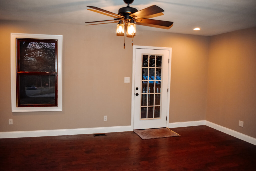
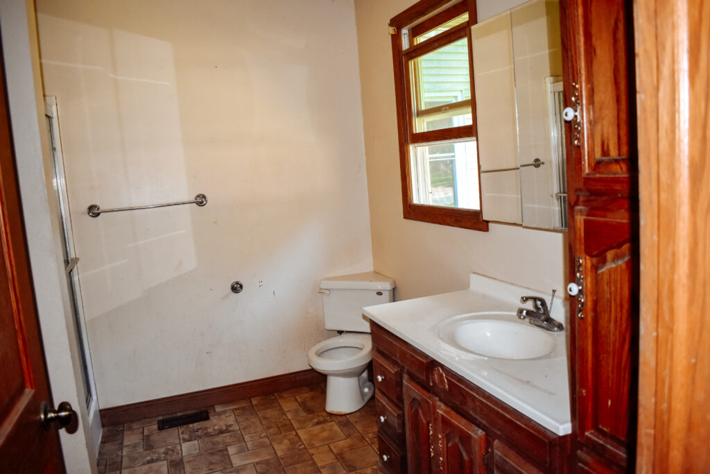
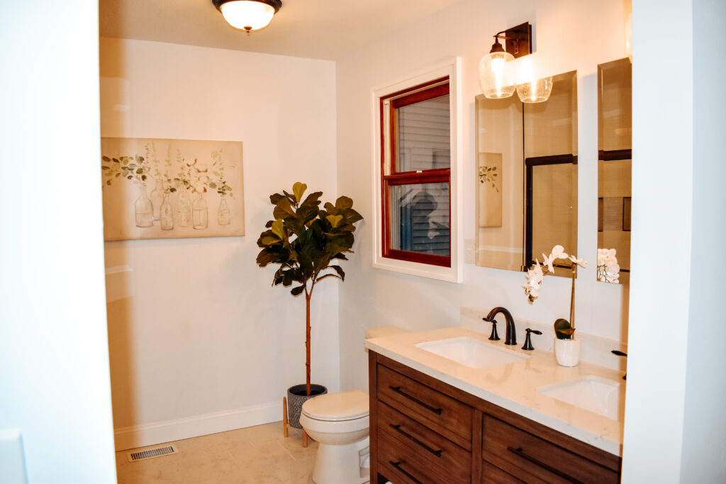
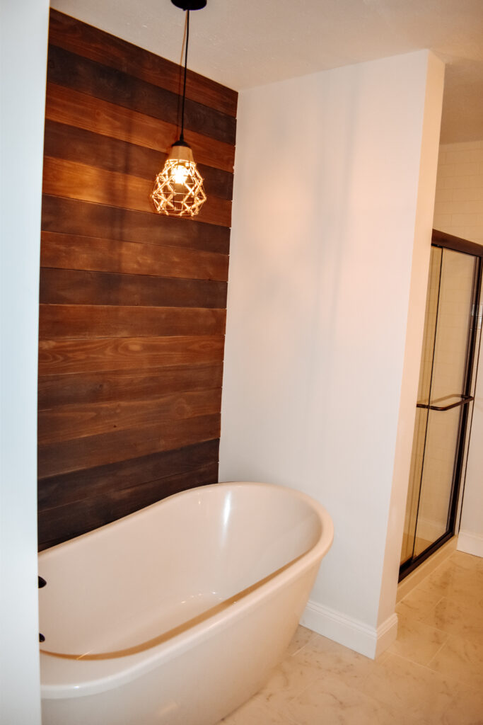
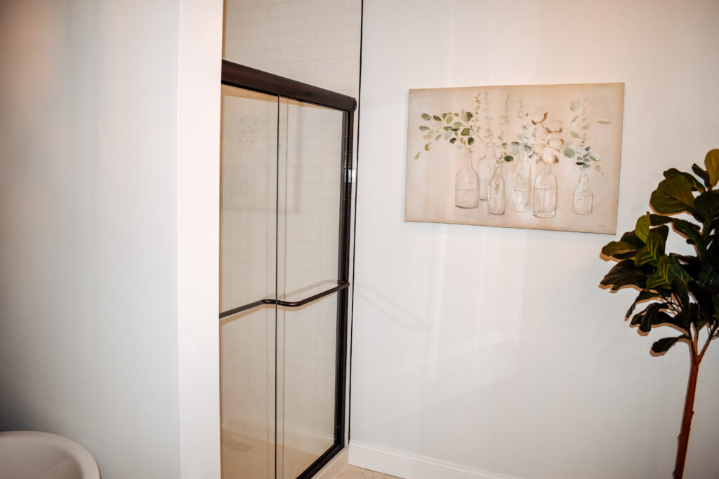
On the other end of the dining room was the main suite addition. Throughout the remodel, this was the room we used as our “office”. It was the newest part of the home and where we stored materials, took our breaks, and ate our lunches. It was also the last part of the house to be finished. The bedroom only needed paint, trim and flooring. It had a very small closet and the bathroom needed updating too. We took part of the bedroom to build a new walk-in closet that was attached to the bathroom. In the bathroom, I added a free-standing tub with an accent wall behind it and a pendant above. We also added a two-sink vanity, new lighting, and tiled shower.
These rooms are only the back part of the main floor. There are many more rooms to go and I don’t want to turn this into a book so I’m going to split it up into a couple more posts. Be sure to come back to see the rest of the transformation! Oh, and if you’re getting inspired and want to see if we can help you with your remodeling or decor issues, grab our Signature Services guide.
